Best Colors to Use in Advertising
The power of color is that it stimulates the subconscious and emotions. However, the first impact of color has to work quickly because you only have 30 seconds or less to make a good impression with a web page, and 60-90 seconds with other advertisements.
Colors stimulate an instant reaction from the subconscious and it can be positive or negative. So choosing the right colors are very important for marketing your website, business logo, business cards, brochures, signs, and even your stationary.
Advertisements and the look and feel of your website, should attract and appeal to consumers. Colors are part of the way you project an image for product, but it depends on what you are selling and the target audience.
Color preferences vary with age, sex and what people expect from a certain types of businesses. Some of the considerations are:
- Is your business selling a warm and family oriented product?
- Are the advertisement colors bright, vibrant and colorful so they will appeal to children?
- Does the site relate to business, banking, investment and advice about money then blue and green colors are what people expect?
- Is the product new and exciting then bright light colors may work best?
- Is the product designed for teenagers, then it is important to know what they prefer?
This article is designed to answers all your questions about color by providing comprehensive reviews and summaries. Learn all about the best colors to use in advertising and what color portrays about your product and business.
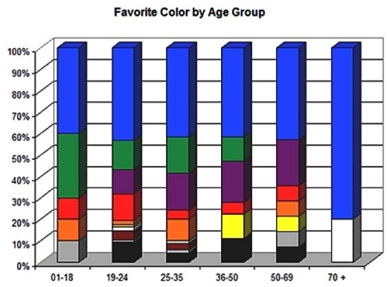
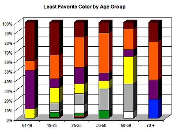
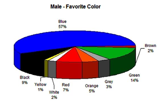
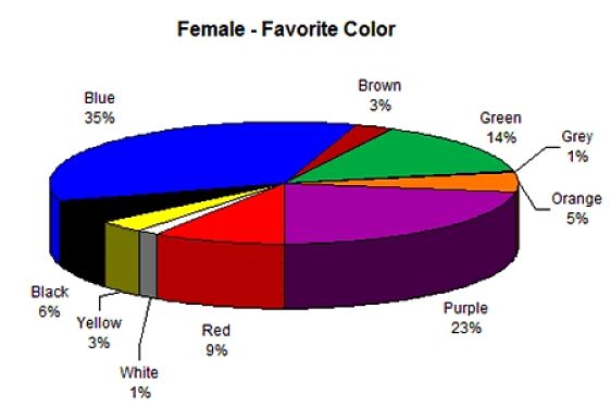
The graphs above show how that there are major differences between the sexes and various age groups in terms of color preferences:
- Blue and Green or universally favorites overall.
- Browns and Orange are generally disliked
- More than 50% of males have Blue as their favorite color, followed by green, red and black
- Less females than males like Blue, but Purple is very popular with females, but not with males. Red is also a favorite for females.
What do the Various Colors Portray to the User
BLACK
- Black is a very formal color in advertising, hinting of established stellar brands, and shiny black is a mark of excellence
- Suggests power, boldness, authority, seriousness.
- It is serious, distinguished and classic.
- Black is excellent for creating drama and authority
- Good background color for print, but not for websites and video
- Ideal background for dramatic colors such as pink, yellow and lime green and even white Black also implies submission and can be associated with mystery and evil.
BLUE
- Blue is the most popular and has the highest color. More than 25% of the world’s most valuable brands use blue as a dominant color in their logo (for example IBM, Nokia, HP, GE, Intel, Gillette and American Express.
- Blue is a dominant color in natures, being the color of the sky and ocean.
- For many religions blue is linked with peace, love and helps keep bad spirits away.
- Blue can have somber or sobering effect, be associated with cold and icy winter days.
- Blue is often associated with authority or discipline being the color of uniforms used by military personnel and police officers.
- On websites it goes very well with red and can create a 3D effect.
- Blue suggests authority, faithfulness, security, dignity and fiscal responsibility and a sanctuary that can be trusted.
- Blue can also be cold and depressing if other colors are not used and darker dull tones dominate.
- People are known to be more productive in blue rooms.
RED
- Red is a very powerful color, especially on websites in combination with blue.
- Red symbolizes power, vitality, energy and vigor.
- Red is an attractive color to most people, especially women.
- Red is very popular in the motor industry where it signifies red speed, power, excitement and high quality.
- Read is a popular color in beauty products like lipstick, nail polish and in advertising perfume and other health and beauty products.
- Red is also known to stimulate the appetite makes it very popular for advertising food.
- Red can also signify danger, and because of its mixed messages red is often used to signify passionate emotions, vigorous reactions and action.
- Red suggests strength, sex, excitement, passion, vitality.
- It can also signify warmth, heat, aggressiveness and can be confronting.
- In business it is often associated with debt, or with businesses that are in trouble.
ORANGE
- Orange is a toned down shade of red. Orange is surprisingly one of the least favorite colors.
- It is associated with warmth and the colors of dawn and sunset.
- It is used for many energy drinks, orange-flavorings and is also popular for children' toys and other products.
- Orange can be associated with shoddiness and cheapness.
- While orange also stimulates the appetite, it is not used for high quality foods, but for cheaper items and drinks.
- Orange is associated with suggests pleasure, endurance, strength, excitement, cheer and ambition.
- In business it is often used as a background color and for highlighting data on charts and graphs.
PINK
- Pink is a very feminine color and is widely used for advertising baby related goods.
- Pale pink is widely used for powders and lotions for women and babies.
- Although pink can have a calming effect, many men often find pink annoying and not something they should take notice of.
- Pink is often associated with sweetness and is a popular color for sweets, candy, confectionary are desserts.
- Pink suggests gentleness, femininity, well being and innocence.
- In business it is often avoided except for products targeted at women and babies.
YELLOW
- Yellow has two conflicting sides. It is a very eye-catching color, often used for highlights and text on dark backgrounds. But yellow can be tiring to the eye and can overwhelm to the mind.
- Yellow is a happy, energetic color, linked to the color of flowers and the sun.
- Yellow symbolizes rejuvenation and is often used in many beauty products.
- Yellow is less popular with males and many men find it distasteful and recently it has developed an association with 'cheap' goods that fail to work.
- Yellow is very popular for food advertising and for advertising of toys and children's clothes and shoes.
- Yellow is often associated with sunshine, happiness, warmth, cheerfulness.
- On the negative side yellow is associated with jealousy, deceit and cowardice.
- In business yellow appeals to Geeks and intellectual types and is used to enhances
- concentration.
- Yellow is a good color for attracting attention on websites.
PURPLE
- Purple is renowned as the luxury color. It signifies royalty and elegance.
- Purple is often used for advertising for women, because it is the second favorite color for women after blue.
- Purple is often associated with costly and high quality goods and so it is not popular for advertising to bargain hunters.
- Purple is very popular with teenage girls.
- Purple suggests royalty, luxury, spirituality and wealth, sophistication, authority.
- In business it is used to signify highest quality and exclusive goods and upscale and it works art items.
- While purple is romantic and feminine it is rare in nature and so can appear artificial and aloof.
WHITE
- The color white signifies purity, devotion, refined products, contemporary and
- truthfulness.
- White is used widely for advertising cleaning substances.
- White is also used to signify newness and freshness, despite its starkness.
- Modern and abstract, white is a perennial favorite for art, home decorations and many White is one of the best colors for use on websites as a background color.
- On the negative side it can be associated with sterility and purity. Doctors
- and nurses wear white to imply sterility.
BLACK
- While Black is not considered by many as a true color, it is very popular in advertising with about one quarter of the top 100 brands using black. It is used by companies such as Disney, Louis Vuitton, Microsoft and Apple as a prominent color for their logos and advertising.
- Black is often associated with exclusivity.
- Shiny black is a symbol of excellence.
- Shiny Black is a very formal color associated with sophistication.
- Black backgrounds don't work well on websites, but many sites use them to create a dramatic effect with white or yellow text.